5 Elements of the Perfect Name Badge Design
Name Badge Designs that Attract Customers and Partners

Name badges are important for events and businesses. They are a representation of the business or event sponsor. Think of them as mini billboards. In many cases, a name tag is the first impression someone will have of you or your organization.
Your business name badge design is very important. A poorly designed name badge might scare off potential customers and business partners. This can happen if the name tag has an unprofessional design or presents unclear information. If you want to design the perfect name tag, you’ll want to consider the essential elements used to create the design.
Designing the Perfect Name Tag
1. Choose Contrasting Colors
Color is no doubt one of the most important aspects of design. It’s too easy to fail at this first step. Choosing the right colors is important, since you want to make your name tag stand out. Combining the wrong colors affects the rest of the design.
Colors should reflect your brand. However, you don’t want to go overboard. Not every color has to match your brand, especially if they don’t work well together.
A name badge usually consists of text and a background. These two colors should be contrasting. If you use a light font color on a light background, it will be hard to see. Use contrasting colors (dark on light or light on dark) to make sure the name badge is easy to read.
2. Make Room for Long Names
As you are designing a name tag, don’t be trapped into viewing the design with a specific name in mind. If the placeholder name is short, it can make things more difficult. If you know your employees’ names, preview with each of them, specifically the longer ones. Test how they look. It’s important to make sure the design can accommodate longer names.
3. Choose Readable Font
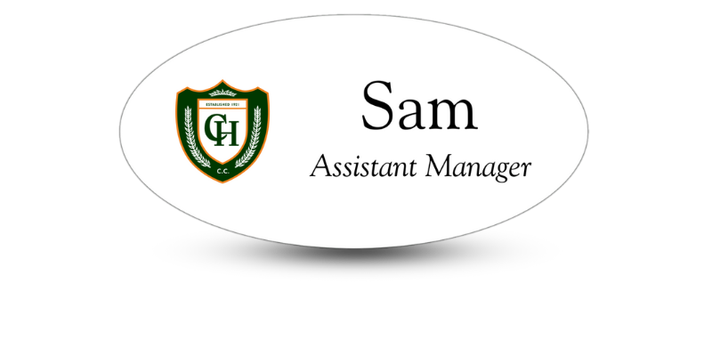
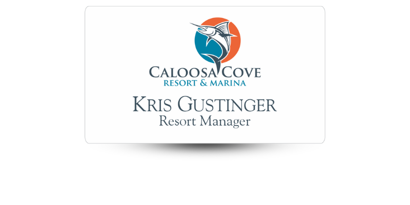
Using contrasting colors isn’t the only thing that helps with readability. Your name badge displays important information about your business and staff. Most name badges include a business logo, the wearer’s name, and the business name. Sometimes, contact information or social media handles are included.
The font should be a good size so that the information can be read from a distance. Looking at it on a computer screen doesn’t give you a good idea about readability, especially if you are zoomed in. Use a nice-sized font that is not fancy, since they are harder to read.
Readability is more important than presentation, especially considering most people will need the information to be readable at just a glance.
4. Logo Clarity
One of the most important elements of your name badge design is your logo. It should stand out and be visually appealing. Just a glance should be enough to clearly identify your business.
The logo should be high resolution. Resizing your logo without a fixed aspect ratio can result in a low-quality, blurred logo that won't win you any business.
5. Protect Brand Consistency
A professional design is needed if you want to attract new customers and partners. The design should clearly represent your business, whether on-site or at an event. You have probably already chosen your colors, fonts, and other design elements that will be used to form your brand’s style. These elements must be aligned with your brand to maintain brand consistency.
Business Name Badges from Name Tag Pros
Ready to let Name Tag Pros help you design the perfect badge? Give us a call and let us get started! Just provide us with your logo and design details, and we’ll begin the process.
Share Article
Categories
View Recent Blog Posts