10 Things Your Conference Name Badges Should Do
Conference Name Tag Design Wins
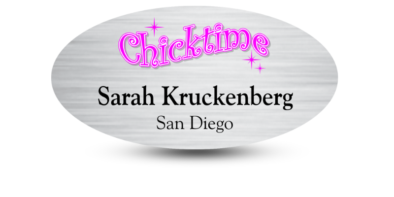
Conference badges aren’t souvenirs. They’re functional tools. When designed right, they support networking, reduce social friction, and give your event a more professional feel. Done wrong, they confuse people, stifle engagement, and become just one more thing attendees throw away. Here’s what your name badges need to do—no fluff, no filler.
1. Display Delegates’ First Names Nice and Big
First names should dominate the badge.
Set the font size at
72pt minimum. That’s not arbitrary, it’s a tested threshold for visibility at a distance. Attendees need to scan a room and pick out names without walking up to someone’s chest. Make that first name unmissable.
Last names? They still matter, but they play second fiddle. Use a smaller size, perhaps 48pt. Keep it readable, but don’t let it compete with the first name. Your layout should accommodate that without ruining readability.
2. Be Legible at about 15 Feet
If a badge can’t be read from
15 feet, it’s too small or too cluttered.
Stand across a room and see if you can read someone’s name without squinting. That’s your benchmark.
Test in natural light, artificial light, dim light—every condition you expect at your venue. Badges should work in all of them.
3. Include a Conversation-Starter
Badges can spark real conversations—but only if you give them the right content.
Ask attendees before the event for
2–3 interests or focus areas. Display these beneath their name, in a smaller font. Keep it clean and concise. “UX | AI Ethics | Public Health” is far more helpful than “Senior Designer at XYZ.”
These mini-topics break the ice. They help introverts start talking. They give extroverts a way in. More importantly, they help people connect with shared interests instead of fumbling for small talk.
4. Be Big: Size Matters
Small badges can be a waste of space.
If you’re squeezing information into a 3x4-inch template, stop. Try something larger instead, like a
4” x 6”. This size gives you room for names, interests, titles, and possibly a QR code or contact details.
Bigger badges don’t just hold more; they read better, hang better, and make your event look more organized. Don’t let badge size be an afterthought. It impacts usability more than you think.
5. Use a Clear Font
A
beautiful font isn’t useful if it’s hard to read.
Skip the curly scripts and decorative typefaces. Stick with
sans-serif fonts like Helvetica, Gotham, or Open Sans. These are clean, balanced, and readable from a distance.
Keep font weights bold enough to see but not so thick they blur together. Don’t use all-caps for names. It slows down recognition and looks aggressive.
Design for readability first. Every time.
6. Have a Small Logo and Conference Title
Logos aren’t the main event. Names are.
Shrink your logo. Stick it at the bottom or in a corner. Same with the conference title. Keep it there for reference, but don’t let it dominate the layout.
Leave off fluff like event dates, venue names, or slogans. They don’t help with networking. And that’s what the badge is for, networking.
7. No Flip-Overs
A badge that flips is a badge that fails.
Use
double-point lanyards. These keep the badge facing forward. Or, go double-sided: print the same info on both sides. That way, even if it flips, it still works.
Also, test how the badge hangs. If it swings around or twists too easily, it’s going to end up backwards half the time. Prevent it before it becomes a problem.
8. Be Adjustable (and Comfortable)
People wear badges all day. Make them wearable.
Adjustable lanyards are a must. People are different heights and shapes. One fixed-length strap won’t work for everyone.
Choose materials that don’t itch, chafe, or dig into skin. Soft, flat woven lanyards are best. Also, don’t make badges too heavy. But don’t make them so flimsy they curl, either.
The badge should feel like part of the outfit, not an accessory to be endured.
9. Don’t Sacrifice Function for Form
Creative design is great—until it stops the badge from doing its job.
Don’t use triangular badges, badges shaped like puzzle pieces, or translucent plastic that’s hard to read under lighting. Don’t place text vertically. Don’t layer colors in ways that reduce contrast.
Looks matter. But function matters more. A clean, rectangular layout with black text on a white background works. Every time.
10. Be an investment
Don’t treat badges as single-use trash.
Use
durable holders and sturdy lanyards. Collect them at the end of the event for reuse. Provide return bins or offer small perks for handing them back.
Want to offset the cost? Offer sponsorship spots. Print a sponsor logo on the back or on the lanyard itself. It helps cover expenses without crowding the badge front.
A good badge doesn’t have to be expensive. But it should be intentional.
Conclusion: Conference Badges Are a Networking Tool
The badge is often the first thing someone sees after a handshake. It can make that first moment easy or awkward.
When you get the details right, the badge becomes a silent helper. It introduces people. It reminds them of names. It connects shared interests. It boosts comfort and encourages participation.
Every element should support clarity, connection, and comfort. Nothing else.
Design with those three goals in mind, and your badge stops being a nametag.
It becomes part of what makes your event successful.
Ready to leverage the power of the event name badge? Let Name Tag Pros help! Give us a call today, we’ll be happy to make sure your event name tag design stands out for all the right reasons!
Share Article
Categories


