Top Mistakes Businesses Make When Ordering Name Tags (and How to Avoid Them)
Common Name Tag Mistakes

Name tags carry a lot of weight for your business. They can make or break a first impression, help teams run smoother, and reinforce your brand’s professionalism. But when businesses get them wrong, they end up with wasted money, awkward interactions, and mismatched designs no one wants to wear.
Let’s break down the most common mistakes people make when ordering name tags—and exactly how to avoid them.
Avoid Name Badge Mistakes
1. No Design Plan? That’s a Problem.
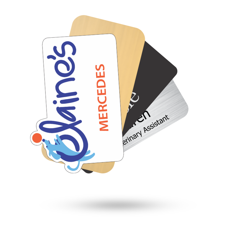
Ordering without a clear layout or style is one of the biggest mistakes. It’s easy to rush into buying what looks good, only to end up with inconsistent designs or unreadable badges.
Maybe one badge has a left-aligned logo and the next has it centered. Maybe the font size changes badge to badge. Maybe your branding is off altogether.
Here’s the fix: Set a design standard before you order. Decide on font styles, sizes, logo placement, background color, and whether you’ll include job titles or pronouns. Stick to it. And always ask for a proof before the badges go into production.
2. Choosing the Wrong Material for the Job
Where your team wears name badges matters. Not all environments are badge-friendly—and not all badges are built to handle heat, moisture, or movement.
Let’s say you order thin plastic badges for an outdoor event in the middle of summer. They’ll warp. Or you pick heavy metal name tags for staff wearing lightweight uniforms. They’ll sag—or worse, tear fabric.
Avoid this by thinking environment first.
- Office staff? Go with durable plastic or brushed metal.
- Restaurant crew? Lightweight and easy to clean.
- Temporary hires or volunteers? Reusable or dry-erase might be perfect.
Pick the right tool for the job. Your team will thank you.
3. Badges That Are Hard to Read
This one’s simple: if people can’t read the name on the badge, the badge has failed.
Some companies overload their name tags with logos, taglines, and background images, leaving little space for the name. Others use fancy fonts that look cool on screen but fall apart from a distance.
Here’s the rule: the name should be the star. Make it the biggest, clearest thing on the badge. Use a clean, sans-serif font. Choose color combinations with high contrast. Test it from six feet away. If you can’t read it, redesign it.
4. Not Including Job Titles or Pronouns
Sometimes, just a name isn’t enough.
Picture this: You’re at a conference. You see “Taylor Jenkins” on a badge. Helpful? Kind of. But knowing they’re the Lead Developer or the Event Coordinator gives you context. Same goes for pronouns, it helps people communicate respectfully and confidently.
Solution: Add a second line for extra info. Titles. Departments. Pronouns. It takes up very little space but adds a lot of value.
5. Ordering at the Last Minute (and Skipping the Extras)
Here’s a mistake that always comes back to bite: ordering too late, and ordering too few.
It happens all the time. A company waits until the week of an event. Shipping gets delayed. A few employees are left badge-less. Or someone’s name is spelled wrong, and there’s no backup.
Always order early. Always order extra.
If you need 40 badges, order 45. If you’ve got an event in two weeks, order today. Build in time for revisions, replacements, or new hires. You’ll never regret having a few spares.
6. Picking the Wrong Fastener
Magnets, clips, pins—each one has its pros and cons.
But when you pick the wrong one, things go downhill fast. Pins poke holes in expensive shirts. Weak magnets slip and fall. Clips break under pressure.
Ask yourself: What kind of clothing will these badges go on?
- Suit jackets? Go magnetic.
- Uniforms or scrubs? Strong clips or pin backings might be better.
- Formal wear? Avoid anything that might damage fabric.
Also, don’t cheap out on fasteners. A good badge that doesn’t stay put is useless.
7. Letting Branding Fall Apart Across Teams
Branding matters, even on name tags. Letting each team or department order their own design often leads to chaos: different colors, inconsistent fonts, off-brand logos.
It’s subtle—but when a customer interacts with multiple employees wearing totally different badges, it chips away at your professional image.
Keep control. Create a few approved templates and standardize them across your organization. That way, you get some flexibility—without losing consistency.
8. Skipping the Proof Review
You’d be surprised how many businesses hit “order” without reviewing the final proof. The result? Badges that say “Assitant Manager.” Or ones with logos stretched out of proportion. Or names that got auto-corrected into nonsense.
Once they’re printed, you’re stuck.
Always review your proof. Slowly. Carefully. With at least two people checking every detail: spelling, job titles, spacing, alignment, colors. Don’t rush it. This is your last chance to catch a mistake before it costs you.
Avoid These Mistakes: Order from Name Tag Pros – We’ve got You Covered!
A name tag should be simple, but it should never be sloppy. When they’re done right, they make people feel seen, reinforce your brand, and help your business look polished. When they’re rushed or poorly planned, they do the opposite.
Sure, you can order for cheap online with a company that mass-produces what they call name tags. Or - you can order from Name Tag Pros where you'll get the personal attention you need and quality assurance to boot!
With Name Tag Pros, we'll make sure you avoid common mistakes by helping you:
- Plan your design.
- Choose the best materials for your environment.
- Make the name readable.
- Include helpful info.
- Provide a proof so you can review every detail.
- Shop with Name Tag Pros! We’ll take care of you!
It’s not just a name tag. It’s a representation of your team and your company. Make it count.
Need help with your next badge order? We’ve got you covered—quality materials, clear designs, and expert help to make sure you get it right the first time.
Share Article
Categories
View Recent Blog Posts