Conference Name Tag Layouts That Take The Best Pictures
Name Tags that are Readable, & Designed for Social Moments

Why Conference Name Tag Layout Matters
The perfect conference name tag layout does two jobs at once. First, it helps people recognize each other at a glance. Secondly, it stays legible when it is captured in photos. This is more important than you may think. Phones usually shoot images at an angle, in mixed, even questionable, lighting, and while people are still moving. In these conditions, thin fonts, small type, and low-contrast color schemes can disappear.
Readable name badges make hallway conversations smoother, group photos more inclusive, and social posts clearer. Having clear means of identification also helps make events safer, since staff is identified easier and speakers or other roles can be seen at a glance.
Building Hierarchy: What Should Be Readable First in a Crowd Shot?
Creating a readable event name badge begins with hierarchy. There should be an intentional reading order that matches how people scan name tags in crowded rooms as well as how cameras capture them. A camera should present a clear shot with name badge info clear in the end results through step-and-repeat photos, quick group shots, and booth selfies.
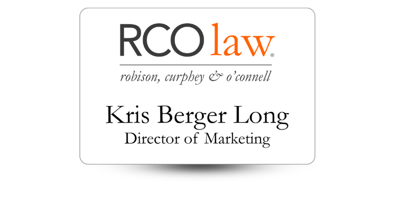
There is a simple hierarchy that works for most conferences:
· Attendee Name: Largest, highest contrast, easiest to see at a glance.
· Company or Organization Name: Supporting line, still clearly visible at a few feet away.
· Title, Role, or Track: Helpful context in networking, but still shouldn’t overpower the wearer’s name.
· Optional Details: Pronouns, hometown, session code, or QR code, but only if they fit without crowding out the essentials.
For the fastest scanning capabilities in photos, center attendee names in the upper half of the name tag. This areas remains visible even if the badge swings, a lanyard twists a little, or a jacket covers the lower edge of the name tag.
Do you want to add speaker or sponsor identifiers? Treat them like supporting information. The person’s name still needs to be the main element. A “Speaker” label that is contained and simple (like in a single bar) is more photo-friendly than adding a second headline that tends to compete with the name.
Font Sizes that can Survive Phone Camera Shots
You don’t need trendy typography to take a great photograph. It needs to be stable under blue, compression, and distance. Choosing a beautifully styled, thin font that looks good on screen can turn fuzzy in motion or totally disappear in a busy photo.
A name tag should be read comfortably from 6 to 10 feet away. If it can, then it’s more likely to be clear in crowded photos. Accomplish this by:
· Making the name the largest line on the name tag, in a bold weight font.
Setting the company or organization name just a little smaller than the name, but clearly readable from several feet.
· Using a smaller, supporting font style for titles is helpful up close, not necessary from a distance.
· Choosing a clean font and avoiding thin strokes that blur in photographs.
· Using comfortable line spacing so letters don’t run together in photographs.
· Avoiding all-caps for long names.
If the name on a name badge is barely readable on a print test, it will usually be unreadable once it’s partially covered, angled, or captured in a quick phone shot.
How to Choose Contrast and Color Schemes that Reduce Blur and Glare
Contrast is one of the main factors that determine if a badge stays readable in a photo. Phone cameras tend to boost contrast and smooth details, which can wash out low-contrast colors, or lose details if the name tag uses a dark-on-dark color combination.
You’ll get better results if you use dark text on a light, solid background for the name and main details. If you want to use your brand color, use it as an accent, like a role bar, instead of putting the name over a pattern or multicolor background.
To achieve the best contrast:
· Use high-contrast text for the name, dark text on a light background is the best.
· Don’t use busy patterns behind information. Patterns dominate the space in photos.
· Using solid color blocks behind key information like a role, gives the text a sharp edge.
· Protect against glare by avoiding glossy surfaces or big, glossy areas as overhead lighting can turn them into unreadable hot spots.
· To reduce glare, consider finishes that reduce reflections like matte options.
Placement Rules: Where does everything go on a conference name badge?
Having a clean layout helps prevent the “but everything is important issue. When you’ve got too many elements competing, the name (the most important networking tool) shrinks first. This makes the badge harder to read in a photo.
Practical tips for most event name badge designs:
· Top Zone: Use this area for event branding, small logo, or event name, but make sure it’s not oversized.
· Center Zone: This area is where the attendee’s name goes. It should be the largest text on a clear background.
· Lower Zone: Use this area for the company or organization name and the person’s title or role.
· Lower Corner/Bottom Area: QR code or social handles if you are using them.
If you use sponsor logos, make them smaller and further away from the name block. Sponsors can be visible without needing to compete with attendee names.
Name Tag Design Tips for Capturing Social Media Moments
Most of the time, name badge photos are not planned. They happen while attendees are walking, turning toward the stage, leaning in for a selfie, or laughing. These moments have at least an air of spontaneity, meaning the name tag might be partially blocked, angled, or twisted on the lanyard.
Here are a few name tag design tips to ensure readability even in spontaneous photo shoots.
· Create a photo zone for the name by keeping it high enough and big enough that it stays visible even if the bottom of the name badge is covered by hands or a jacket.
· Use a simple, strong name block and avoid placing the name on top of textures or gradients that break up letter edges.
· Plan for lanyard twists by keeping the most information centered so it’s readable even if the badge rotates a little.
· Be respectful and clear with preferred names and pronouns. Put them close to the name (usually under it), make it a readable size, don’t put them in tiny corner text.
· Do your own phone test by taking a selfie and a 6 to 10-ft photo of a print sample If you can’t read the name instantly, adjust it before you order hundreds.
Need Photo-Worthy Event Name Tags?
Give us a call at Name Tag Pros! We’ll be happy to design your photo-worthy conference name badges, or work with a design you have in mind. We’ve got decades of experience and expertise ready to put to work for you!
Share Article

Categories
View Recent Blog Posts